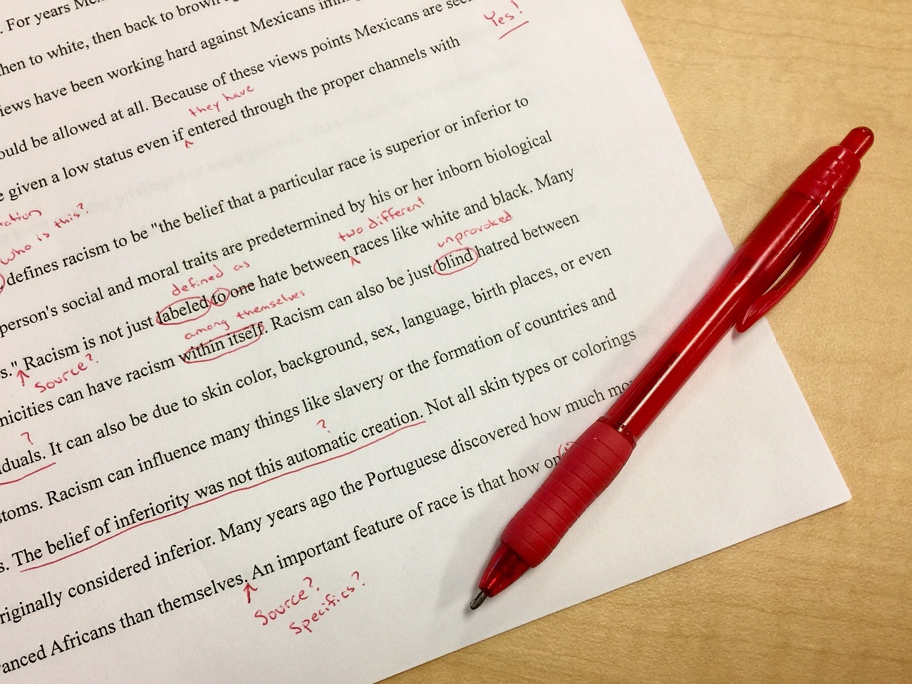
Hi there! Thank you for taking time out to review my website and providing valuable feedback. I appreciate your honest opinion.
1. Broken Links: If any broken links are found, please let me know the URL of the page containing the broken link so that I can fix it immediately.
2. Spelling Errors: Please provide details regarding any spelling errors you found on the website. This will help me correct them for future readers and visitors.
3. Weird Layout: Can you please explain how the layout of the website is weird? Is there a specific element that you find hard to use or unfriendly?
4. Missing Information: If any information is missing from a particular page, please let me know which page it is and what information is needed. This will help me update the content accordingly.
5. Not Friendly Writing: Can you provide an example of not friendly writing on the website? What changes would you suggest to make it more user-friendly?
6. Legal Issues: If there are any legal issues with the content or images used in the website, please inform me so that I can address them accordingly.
7. Design Elements: Please provide specific examples of design elements that seem out of place or weird. This will help me identify areas for improvement and update the design accordingly.
8. Overall Impression: Finally, please share your overall impression of the website after going through the instructions provided above. Was it helpful? Did it address all your concerns? Do you have any additional suggestions to make it better?
Thank you once again for taking time out to review my website. Your feedback is valuable and will help me improve the user experience on the site.


Great site overall. A few little improvements. I would improve the lettering “Exploring the human experience ….. “ I would make it more legible the words seem to fade into the background. I did not get any broken link errors. I did not see any spelling or grammar errors. Overall I am not sure what audience you are conveying information to. As for the design and layout it is a little confusing. The home page should maybe include any links or videos to other pages. I had to click through every link to find information . I love the images that were used. Great job!
LikeLike